
The yield curve has long been regarded as a reliable predictor of future economic activity. Since the beginning of 2018, there have been a lot of talks about rising yield as the Fed started to aggressively raise rates in the backdrop of positive economic outlook and rising inflation. A few days ago, we just saw the 10-year Treasury hit 3%, the first time since 2014 while the shorter term Treasury yields are steadily rising. Hence the concern about yield curve inversion comes into the picture. Yield curve inversion is deemed as a good leading indicator of impending bear market and recession. There are many research and analysis done to ascertain its statistical significance. For this article, I will not be looking at bear market or recession. As my quant system currently only focus on stock trading, it is more useful for me to look at whether the yield curve can be a good predictor of stock market crashes. The historical data I am using for the analysis dated back to the 1960s.
Before I begin, let me explain some of the financial jargons used in this article.
What is the Treasury Yield?
As defined in Investopedia, treasury yield is the return on investment, expressed as a percentage, on the U.S. government's debt obligations. Looking at it another way, the treasury yield is the interest rate that the U.S. government pays to borrow money for different lengths of time. The rate of return or yield required by investors for loaning their money to the government is determined by supply and demand. When demand for the security is low, the yield will rise to entice more buyers. Conversely, when the supply of the security is low, its yield will drop, making it less attractive to buyers.What is Yield Curve?
As defined in Wikipedia, the yield curve is a curve showing several yields or interest rates across different contract lengths (2 month, 2 year, 20 year, etc. ...) for a similar debt contract. The curve shows the relation between the (level of the) interest rate(or cost of borrowing) and the time to maturity, known as the "term", of the debt for a given borrower in a given period. During periods of healthy economy, the yield curve has a gentle upward sloping shape, with shorter term yield having lower yield than longer term. Reason being longer term bond has more risk so investors tend to expect a higher rate. Another explanation is investors anticipate rates to rise in the future and hence expect a higher rate if they are to lock in their cash now (see below chart).

For my analysis, I am using the difference between the 10-year and the 1-year US Treasury to determine how the supply and demand of the two securities played out over time. Typically, the yield curve lies in the positive region of the chart. When it turns negative, that is the point where the yield curve flattens and then inverts (see below chart).
So what did you find?
In the 10-yr to 1-yr Treasury (green area) chart below, I highlighted regions where the yield curve are negative. There are 9 regions in total. I also superimposed the S&P500 log price chart (blue line) for the same period.
Here is the meat of this article. Let's look at what happened around the region when the curve started to turn negative. I shall zoom into a 10 years time period and detail the date the curve turned negative, the date of the next stock market (supposedly) crashed and also how significant was the drop.
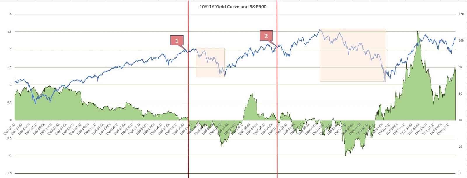
Signal 1
Yield curve started to turn negative on 29 Sep 1965. 4 months later, the stock market dropped 20% starting from its top recorded in early Feb 1966
Signal 2
Yield curve started to turn negative on 06 Dec 1967. 1 year later, in late Nov 1968 the market plummeted 32%.

Signal 3
On 09 Mar 1973 the curve turned negative. The market already started dropping since Jan 1973, registering a 47.99% drop.
Signal 4
For the 13 Aug 1978 inversion, the market didn’t really crash but it was choppy trading for the next 2 years
Signal 5
The inverse was registered on 15 Sep 1980. 2 months later in late Nov 1980 the market fell 26.20%.

Signal 6
Inversion started on 25 Jan 1989. 10 months later in early Oct 1989 the market dropped 16.38%. This drop was not that significant so I would consider it as just a correction.

Signal 7
On 20 Mar 2000 the curve inverted. This was the period of the DOT.com bubble. Few months later the market started to drop posting a decline of 47.58%.
Signal 8
The curve turned negative on 27 Dec 2005. One and half years later in early Jul 2007 the stock market plummeted 55.98% which was the Great Recession.
Are there instances where the stock market crashed but the yield curve did not invert?
Yes. For example, Black Monday. On 19 Oct 1987, the market crash was not preceded by the yield curve inversion (Plotted region with a (*) in above chart).If the yield curve inverts, what is the probability of a stock market crash?
Based on the data sample above starting from 1962, if the yield curve inverts, 7 out of 8 times the market ended up in a decline in the next 1 year or so, the least being 16.38% and the most being 55.98% drop. Though the sample size is not that big (8, but I would prefer to have at least 30 instances) but I am inclined to say that this leading indicator does exhibit a significant degree of accuracy which is 87.5%Is it useful for my DIYQuant’s strategy?
For now, I would consider it as useful for risk management. Will I fully unload, when the yield curve inverses? Probably not. It has a lead time on average of 10 months. Take the 2008 Great Recession for example. The inversion happen in late 2005, but the stock market only started to plummet 1.5 years later. If I were to cash out my whole portfolio, I would have missed out the later part of the bull run. Instead, I would perhaps start buying some put options to hedge or to defer any new investment strategies. Or maybe if I am planning to sell off my properties I would start looking for buyers.Looking at the current yield curve chart, can I say that we are still some time away from a stock market crash?
It does not mean that the stock market will not crash when there is no yield curve inversion. But if the yield curve invert, it is likely we will experience a market decline in the near future. The 10-year to 1-year yield curve has recently fell to 0.7. If you look at the chart above, the trend has been downward since 2014. When will it hit 0? Nobody knows. If it reaches 0, it is likely we still have a bit of time to run for the doors.
What is the moral of the story?
Never ignore an inverted yield curve.This article is based on my own analysis and my own opinion of the outcome. This does not constitute an investment advice and readers should perform own due diligence when making investment decisions.
Get Full Access and follow our system's quest for ABNORMAL returns
Performance Join as Member
Follow our blog on Facebook!


Hey,
ReplyDeleteThanks for the interesting read.
I was wondering where did you get your treasury yield curve data from? I can't seem to find it.
Azrael
Hi, I got the data from this site https://www.federalreserve.gov/datadownload/Choose.aspx?rel=H15
Delete